A cleaner world with every wash
Seepje
The sustainable Dutch soap brand Seepje (‘Soaply’) has been on a mission since 2013 to make the world a cleaner place. The "dark green" target audience is already convinced. How can we, with a refined brand strategy and new identity, ensure that the "light green" mass also considers to start washing fossil free with Seepje? It was on us to get our hands dirty.
A bold rebranding. Loud & clean.
The starting point is the iconic bottles with their rounded corners. Since the start they’ve made a statement in shops, near kitchen sinks, and in bathrooms. By emphasizing this shape more prominently in the logo, we create a distinctive softness and a sense of unity.The Higuita Formula™ for extra freshness
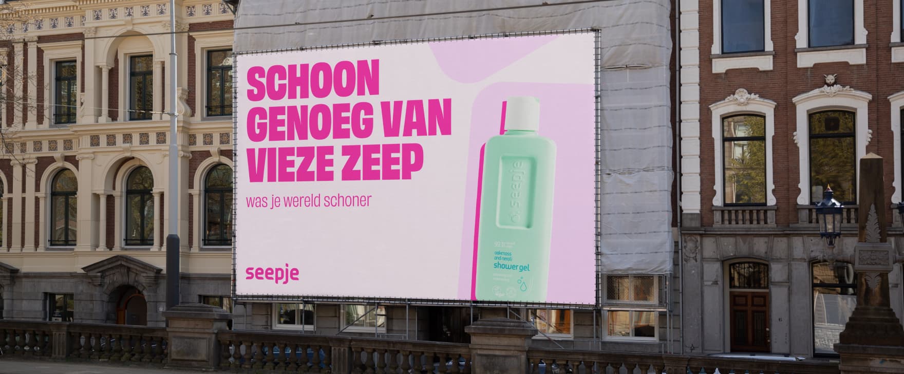
New design elements support the brand. And by adding a complementary color palette to the striking pastel colors of the packaging, every expression contributes to the positive message Seepje wants to share with the world.Taking Seepje to the streets
In nationwide out-of-home campaigns, the renewed Seepje makes itself heard. A Dutch audience is convinced of cleaner washing in a thoughtful, yet slightly activist way. Quirky headlines in a bold typography give the brand a contemporary voice.
